Tutorial
In this short tutorial we will describe how you can use the 3D-GNOME web server and demonstrate the sample results.
Suppose that we are interested in a 8966211-11059337 region of chromosome 1. To start go to the New request page. There is a number of options available there, but it is enough to provide the genomic region of interest. Enter the value "chr1:8966211-11059337" in the Region to reconstruct field and click the Send request button below. A notification of successful request submission should appear at the top of the page together with a link to the results page. You will find there a graph showing chromatin interactions in the submitted region, a 3D model of this region and other graphs and statistics describing the spatial structure of the region of interest (the results are described below in more detail).
Apart from building 3D models of selected genomic regions directly from chromatin interaction data, the 3D-GNOME 2.0 is capable of modeling genomic regions which differ from the reference sample by a set of structural variants (SVs) like: deletions, duplications, inversions or insertions. To model a structure of a genomic segment in a human lymphoblastoid cell with identified SVs enter on the New request page the list of these SVs along with the region specification. There are several ways through which you can submit the list of SVs to the server. Click the Select button next to the List of structural variants field on the New request page and a list of all the input options will unroll:
- Upload VCF file - upload a file with SVs in .vcf format from your computer. In the text area named sample IDs provided under the Browse button you can put IDs of only those samples present in the uploaded file for which you want to get models. Multiple IDs should be separated by commas. By default models for all samples from the imported .vcf file are computed.
- Select sample IDs - select IDs of the samples of interest from the 1000 Genomes Project (1kGP) phase 3 .vcf file. After you provide the IDs, all the SVs identified in the 1kGP for the selected samples will be extracted from the 1kGP database and models for each of the samples will be computed. Multiple IDs should be separated by commas.
The computations should take several seconds, but depending on the region size, the selected settings and the current server load it may take up to several hours. You are strongly advised to save the address to be able to access the results later.
If you would follow the link and go to the results page before the computations are done you will see the current status of the request (Received means that the request was sent, Started means that the processing of the request was started). Should there be any errors in your request they will also be shown on this page.
The page with results contains interaction plots, heatmaps and plots presenting statistics. On the left there is a control panel, where you can select, which elements exactly you want to be visible (tick these which are of your interest). This is particularly useful when you inspect multiple samples and want to compare them in different configurations or want to compare only specific elements:
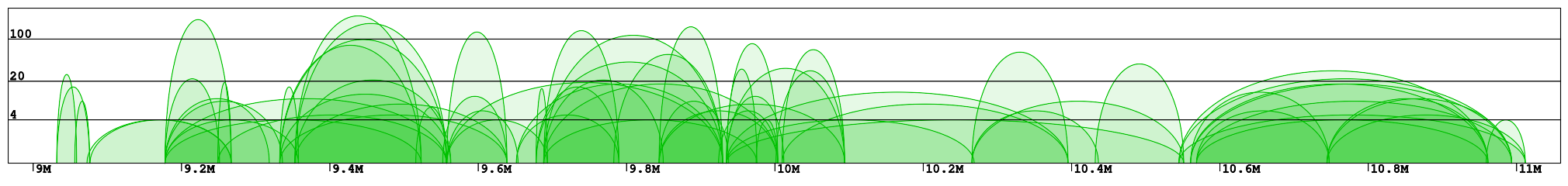
Interaction plot is a graphical representation of the clusters contained in the specified region (Fig 1). Every interaction is represented with an arc of the height corresponding to the interaction frequency. Here we can clearly see which loci are interacting with each other. In the example "chr1:8966211-11059337" we can identify 2 main clusters of interactions (roughly 9-10Mb and 10.5-11Mb) connected by a less condensed region (10-10.5Mb). We can see that in the right cluster (10.5-11Mb) there are 3 main interaction hotspots with multiple anchors, while in the left one the interactions are distributed across multiple loci, with a number of shorter but much stronger interactions (count > 100).
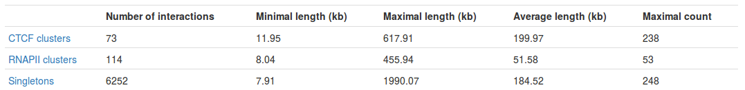
Table with basic statistics (Fig. 2) contains:
- Number of interactions - total number of interactions of a given type
- Minimal length - length of the shortest interaction
- Maximal length - length of the longest interaction
- Average length - average length of the interaction
- Maximal count - the frequency of the most frequent interaction
Please note that by clicking on "singletons" or "clusters" you can download a file with a list of the corresponding interactions.
Interestingly, we can see the most frequent interaction is a singleton and not a PET cluster (248 vs. 238). This may seem a bit misleading at first - please see FAQ for an explanation.
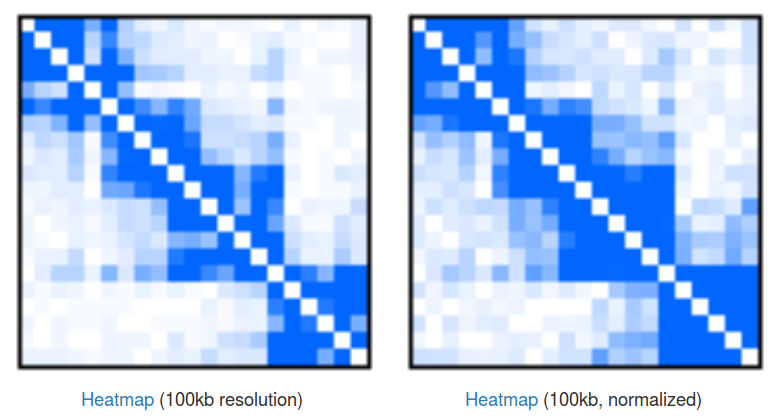
Heatmaps of singleton interactions. Because of the huge number of singletons they are presented in an aggregated form of a heatmap (Fig 3). In a raw heatmap each cell represents the number of interactions between the two corresponding genomic regions. As these numbers are biased (for example by a local region visibility), we normalize all the entries using a simple matrix balancing algorithm called Vanilla-Coverage normalization (for a discussion of different heatmap normalizations see [Rao et al, 2015]).
Heatmaps are useful for identification of contact domains (TADs). In our case we can see that there are 4 visible domains, with the first 3 forming something like a higher-hierarchy domain. This hierarchical nature of domains is something that is very often observed in the data, but there is still no consensus about how to treat them, and depending on your needs you may want to take a look at the individual domains or at the bigger, aggregated ones. Please note that you can click the "Heatmap" links to download the file with numerical representation of the heatmaps.
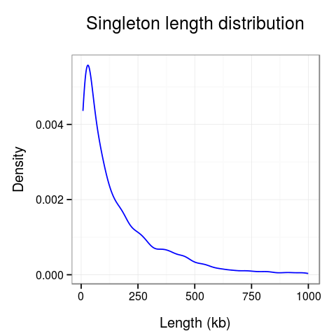
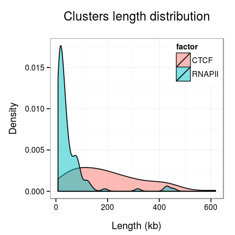
Plots presenting statistics. There are 2 plots showing the distribution of lengths of clusters and singletons (Fig. 4). Based on these plots the density, or looping of the analyzed region can be estimated. For example, a large number of short clusters means that there is a large number of short chromatin loops in the region. We can also study differences between interactions mediated by different transcription factors - here we see that RNAPII forms significantly shorter loops than CTCF does, although there are some longer loops, up to 400kb. Note that for clarity the singleton plot is capped to 1Mb, and the cluster one - to 600kb.
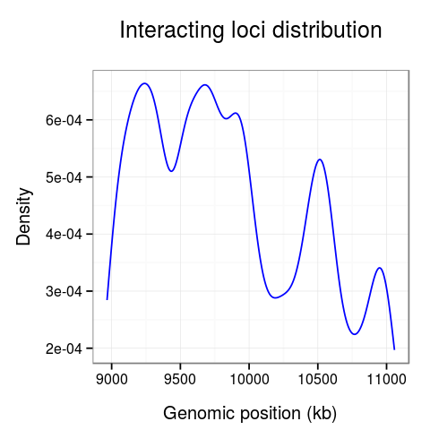
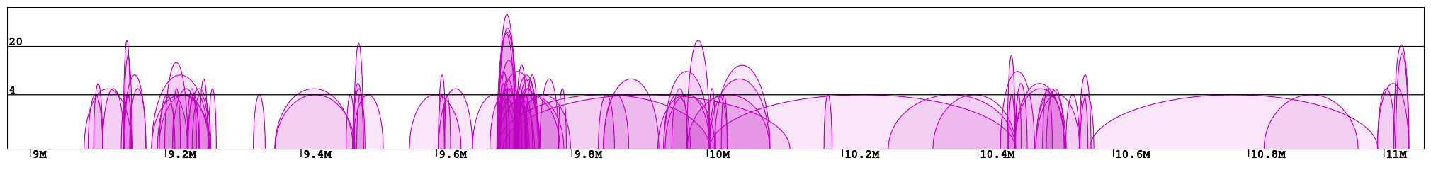
On the last plot (Fig. 5) we can see the distribution of the interactions across the region.
The 10-10.5Mb region seems to have significantly fewer interactions than other regions. Surprisingly, there is also much fewer interactions at the 10.7Mb loci.
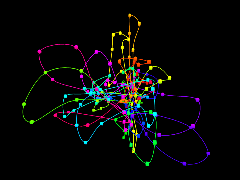
In the right margin of the page with results links to 3D viewer are listed. Again, you can choose the configuration in which the models will be presented: e.g. you can click the link which will present the structure modified by SVs next to the reference structure or solely the former one. The 3D viewers will open in a new page. When you arrive at the page you should see a black background of the visualization plugin and a progress bar with the current progress of model loading. After the model is loaded you can play with it using your mouse (left-click and drag to rotate, right-click and drag to translate, scroll to zoom in and out). There is also a number of options in the collapsible menu on the right.
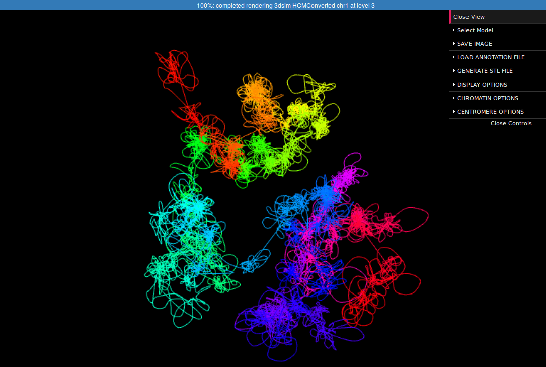
Here we present the visualization for the selected region (Fig 6, left) with a number of chromatin loops. To better understand how the simulation works and how loops are represented we can show the beads used in the simulation using the Chromatin Options->Show spheres checkbox.
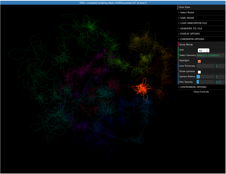
It may be interesting to see where this region is located in respect to the whole chromosome. For this reason we can visualize the whole chromosome (we can create the structure in the same way as for this region, but this time you need to specify "chr1:1-250000000" as a region).
To highlight a region please expand the Chromatin Options submenu, enter "8966211-11059337" in the Select region field and check the Highlight checkbox. Now the selected region is highlighted. You can control the strength of highlight using the Dim opacity slider. Finally, click on the Save image button on top of the menu. Now you can save the screenshot of the structure to your computer.